
Creating and writing developer landing pages is hard, but it doesn't have to be.
I've analyzed 374 developer landing pages across startups and enterprises to figure out what really works in 2025. If you're struggling to get more signups for your devtool, this guide will give you examples, templates and a step-by-step to craft your pages.
Best developer landing page examples: Copywriting and design
After checking out tons of dev landing pages, I noticed that the good ones all had a similar structure:
- Hero (the top section)
- Feature section
- Use case section
- Trust (testimonials/case studies) section
- Pre-footer (final call-to-action)
Let's break them down section by section and see the best and worst examples.
Hero (the top section)
The top section, commonly known as the "hero", is the most important on the entire page.
It's the first thing developers see, and the main reason they'll either stay or close the tab.
To create a great hero section, you must nail these three parts:
- Headline: short and clear explanation of what your product does.
- Subheadline: a quick summary of how it works or what it helps devs achieve.
- Call to action: a clear next step that lets developers try the product.
Let me show some bad hero section headline examples.
Bad hero section headline examples
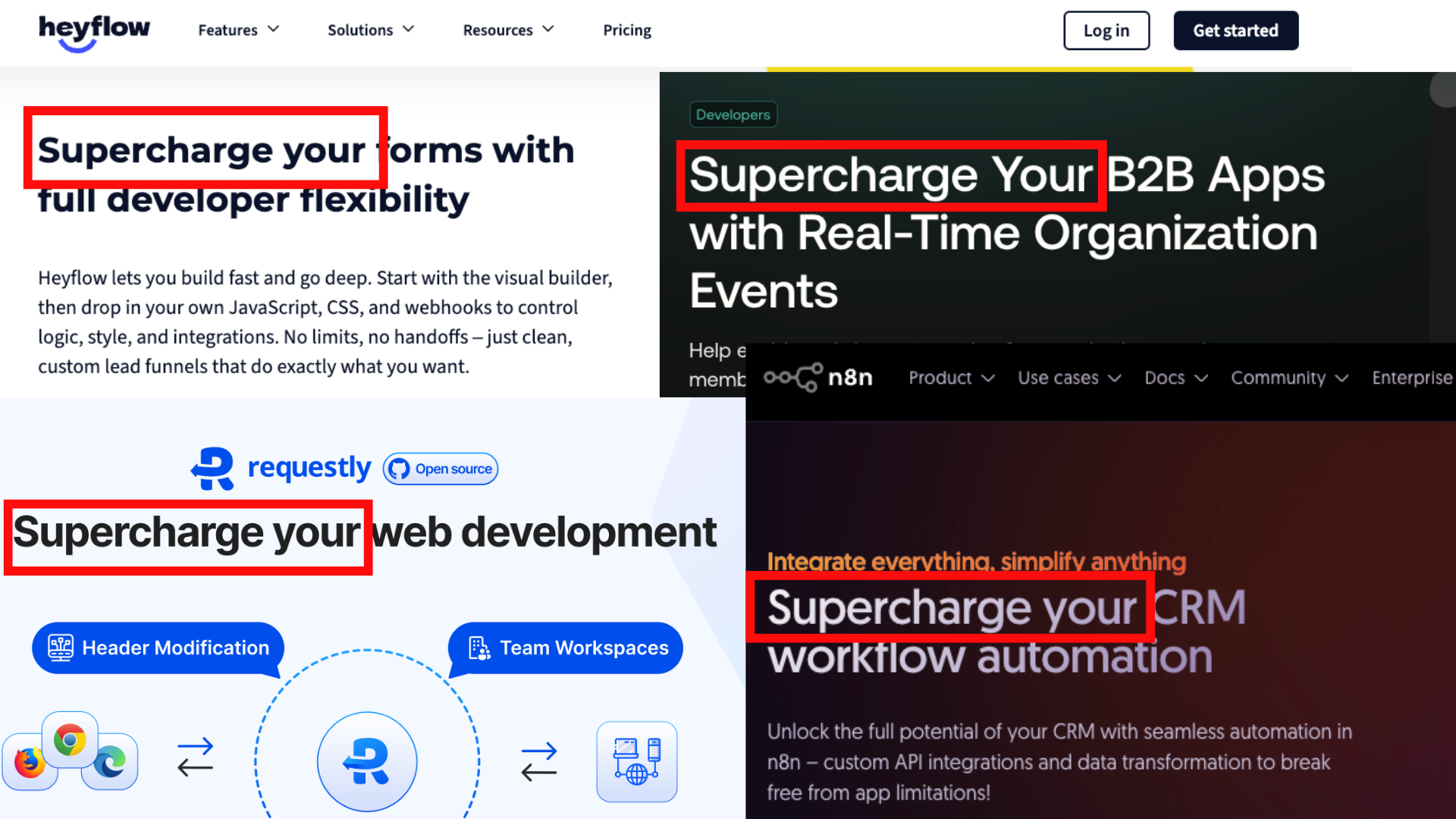
I swear, if I see one more devtool site that says "Supercharge Your [something for devs]", I'm gonna start a religion just to ban these phrases.
And I wished it was the only one, but here we're blessed to read these godly-creative ChatGPT headlines, like:
- "Unlock the power of [data/AI/automation]"
- "Streamline [workflow/process]"
- "Do more with less"
- "Future-proof your [stack/business]"
- "Transform the way you [verb]"
- "Reimagine how [role] works"
The list goes on…
If your first 3-4 headline words don't instantly explain what your product does, they won't stick around.
A single headline tweak can improve engagement by up to 259% (as shown in a MECLABS' headline test experiment). Provide the exact words they expect to see in the first three seconds of visiting your landing page. Otherwise, they'll just close the tab.
The same goes for the subheadline. For example, n8n's landing page:
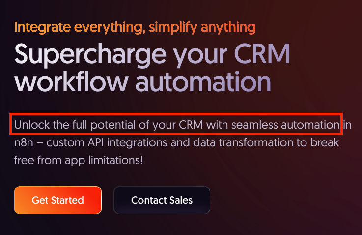
I love their product and all, but what in the ChatGPT world is this shit?
They wasted 10 words to tell you absolutely nothing.
Let me explain how to do this properly, starting with the headline.
Great hero section example
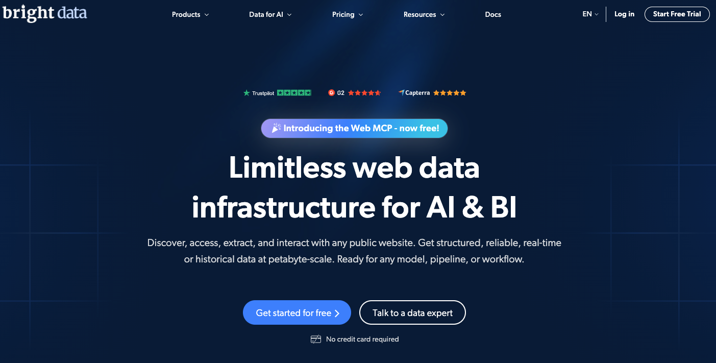
BrightData did a phenomenal job on their homepage.
What makes it so great is that every element of the hero section is there to educate you, provide trust, and make you want to try their tool.
Let me break it down.
The headline

This headline is great because in the first four words, it tells you exactly what it is, followed by for whom it is.
Here's the copywriting formula they used for this headline:
- Adjective: Limitless
- Keyword: web data infrastructure
- ICP / use case: AI & BI
And here's how you can use the formula to write your landing page headline:
First word: Adjective What makes your tool stand out? What does it provide to your users? Examples: Fast, Cheap, Open-source, Secure, Automated, Scalable, All-in-one…
Middle part: Keyword It can be one or three words, just say the keyword they are searching for. Examples: Web Scraper, Proxies, API Builder, Monitoring Tool…
Last part: ICP / Use case Developers want to see that it's for them. Mention their industry or their specific use case. Examples: for Developers, for E-commerce, for SaaS Teams, for AI Models, for Finance Apps…
Of course, there are many more headline formulas, so make sure to follow me on LinkedIn, where I share marketing tips and tricks for devtools.
Now, after we're done with the headline, let's explore how to write a great subheadline for your developer landing page.
The subheadline

This subheadline works because it provides all the details you need to know within the first 10 seconds of visiting the page.
So, using this example, here's how to write your landing page subheadline:
First sentence: Explain briefly what it does, in simple words. Example from BrightData: Discover, access, extract, and interact with any public website.
Second sentence: List the benefits they get or the features they need (you can even put them in bullet points). Example from BrightData: Get structured, reliable, real-time or historical data at petabyte-scale. Ready for any model, pipeline, or workflow.
Remember, no more than three short sentences, or one sentence and 4-5 short bullet points.
Next, we can start with the third part of the hero section, the call-to-action.
The call-to-action

Nobody wants to "Book a Demo". Developers want to try your product now!
So, try to remove unnecessary friction points like requiring credit cards or their blood type.
Let them play with your tool with no strings attached, and if they like it, they can stick around.
There are a few more things that make a hero section great, but we have a lot more things to cover, so I'll explain that in another article.
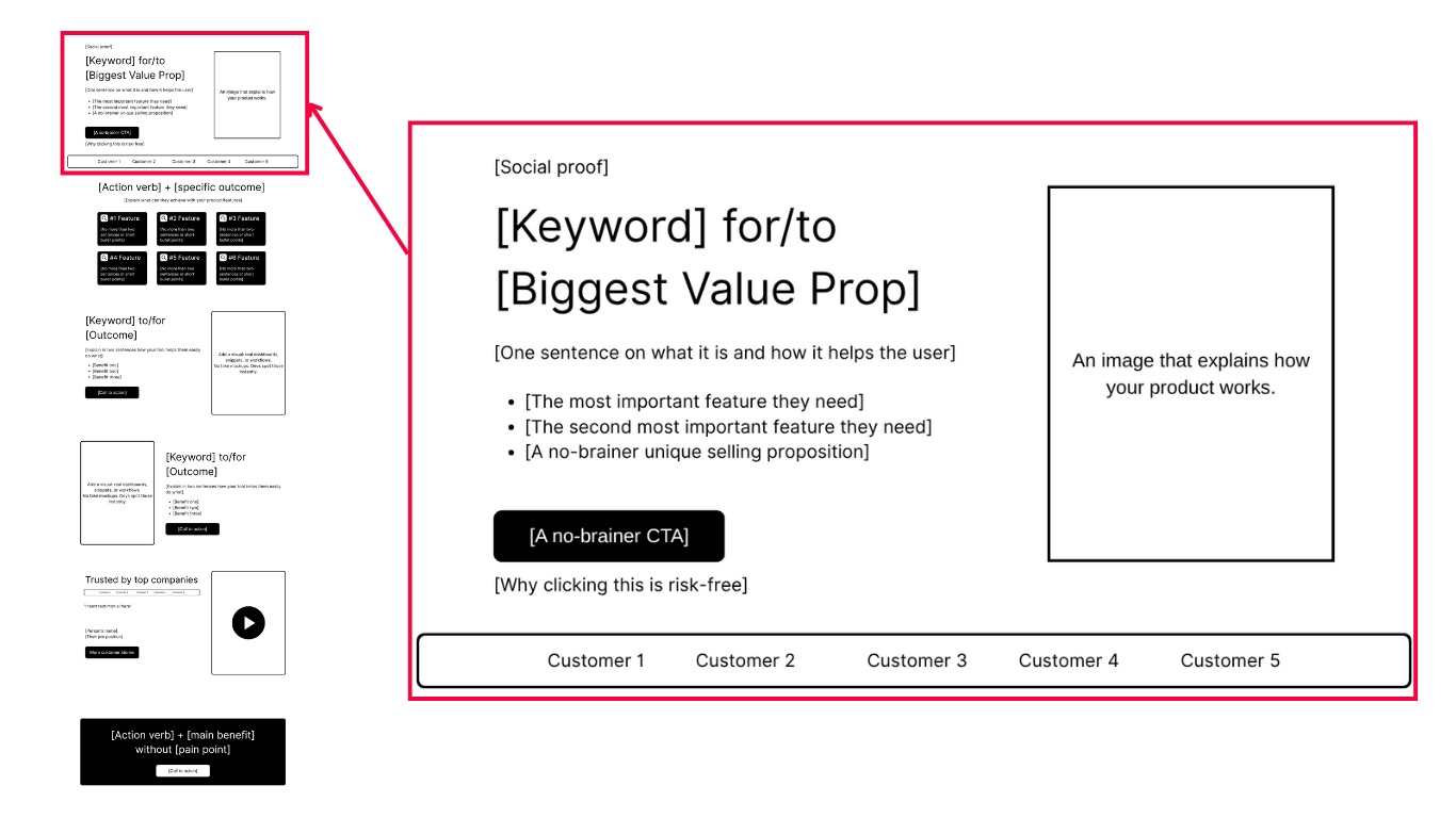
Here's one of my templates that you can use for your hero section:
Hero section template
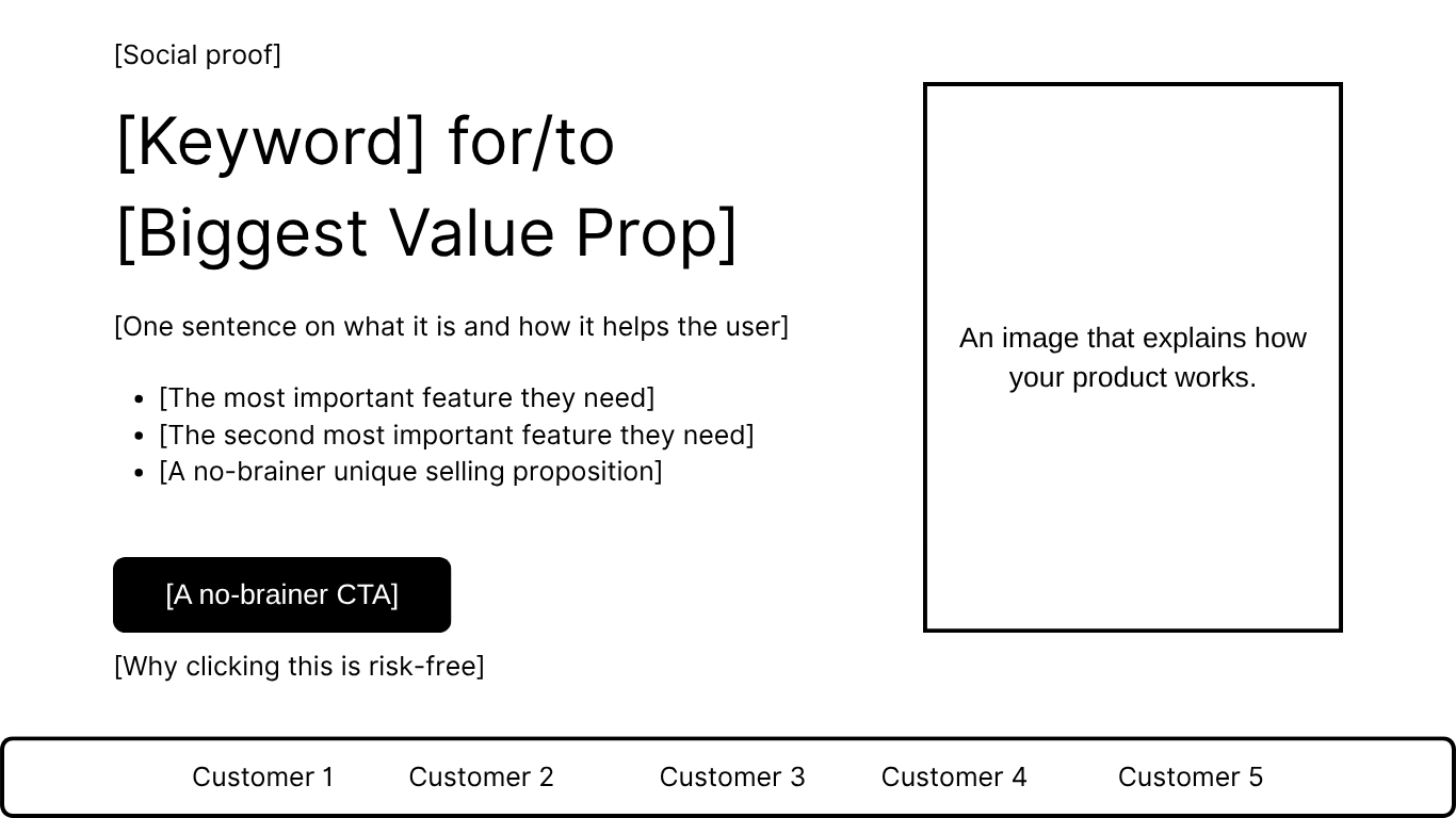
If you followed these steps, your hero section now tells people exactly what your product does and why it's worth their attention.
Next, let's focus on the feature section, where you explain what makes your tool actually useful.
Feature section
The feature section is where most developer landing pages fail.
They dump their features like a spec sheet for an engine nobody's buying.
Developers want to know what's in it for them, in plain language.
Bad feature section example
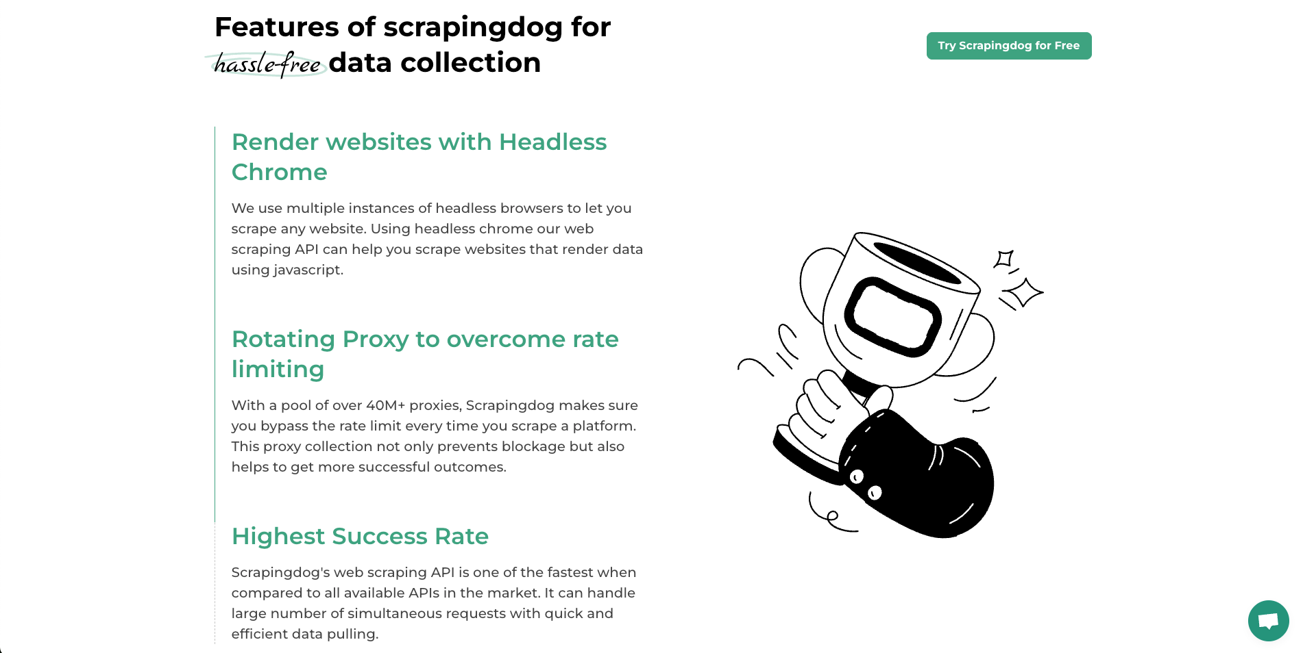
I love the team behind ScrapingDog, but their feature section is straight out of a horror movie.
There's too much text, the flow is terrible, and worst of all… "Highest Success Rate" is not even a feature. It's a claim.
For reference, let's compare them with a:
Great feature section example
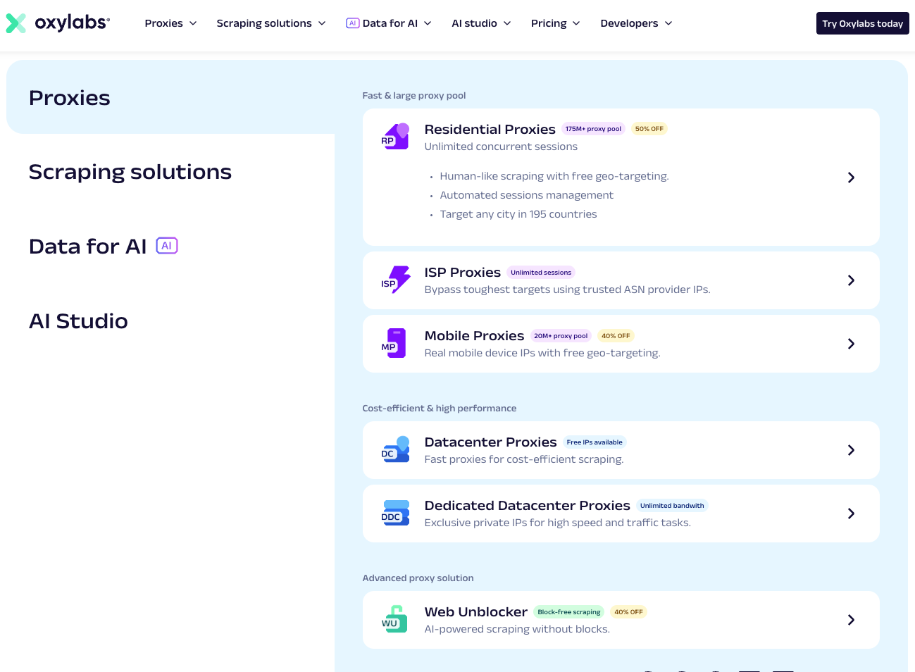
Oxylabs has a similar product to ScrapingDog, but their feature section is different.
Well organized into mini-products, where each feature is explained with short points.
It's easy to navigate.
Because developers don't have 30 minutes to read your autobiography on your website, they scan through your page looking for keywords.
You don't have to be "fancy" as the example above. All you need to do is make it clear and short.
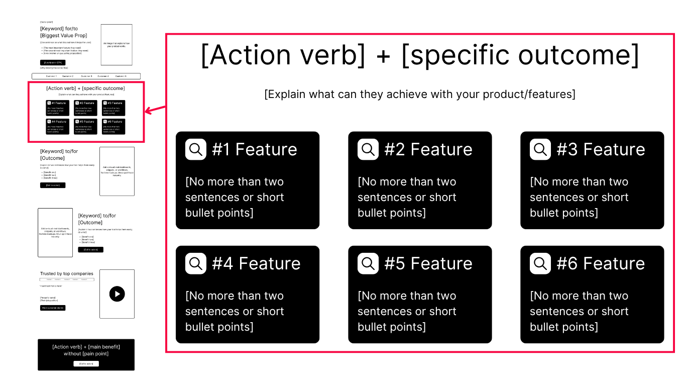
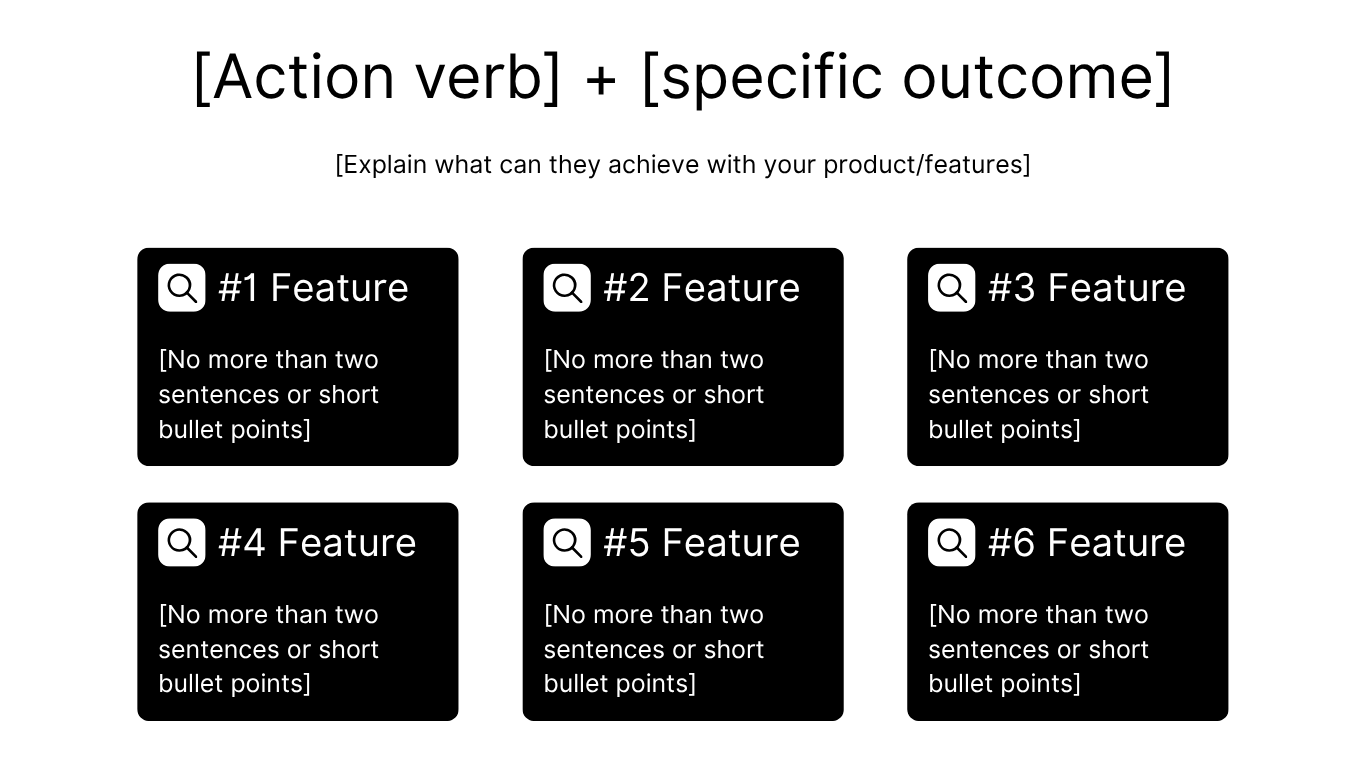
Feature section template
Use case section
If your devtool is for specific industries or users who can do specific tasks with it, mention them.
You want to tell your users what your tool is for, don't let them guess.
I couldn't find a really bad use case section, so I'd say if you display them, you're good.
Let's look at n8n's use case section.
Great use case section example
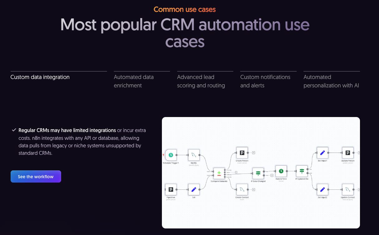
I know that I roasted n8n for their hero section above, but I really can't say anything bad about this part.
It's clear, straight to the point, and you can see screenshots from the tool.
The template that I usually use for this section is pretty similar to n8n's, just instead of picking the options from the top, I display them all on the landing page.
Let me show you my template:
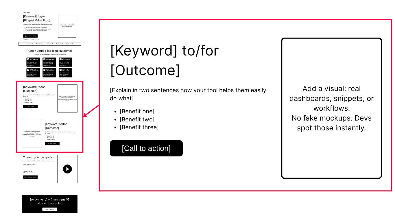
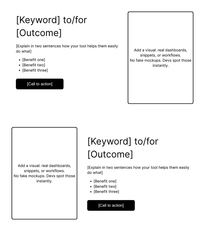
Use case section template
Trust (testimonials / case studies) section
This is the part of your page that adds credibility.
Yet most devtools turn this part into a wall of random logos and vague quotes.
They throw in Google or AWS just to look credible, but without context or real results, none of it means anything to developers.
I know that many are struggling to "extract" the kind words from their users, so I'll write an additional guide on how to do it properly. But, if you need help fast, feel free to message me on LinkedIn.
Now, let's break down one great case study section.
Great case study section example
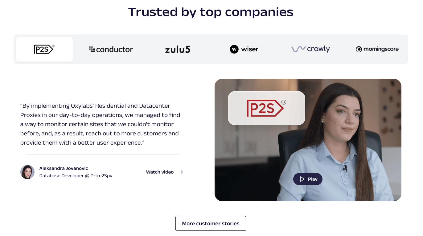
I mentioned Oxylabs previously, but they really know what they're doing.
Just look at their case study section:
They don't just mention "top companies", they show real faces, with real job titles, talking in front of a camera about how their product changed their business.
In case it's not relatable, their call-to-action button leads to more case studies from different industries.
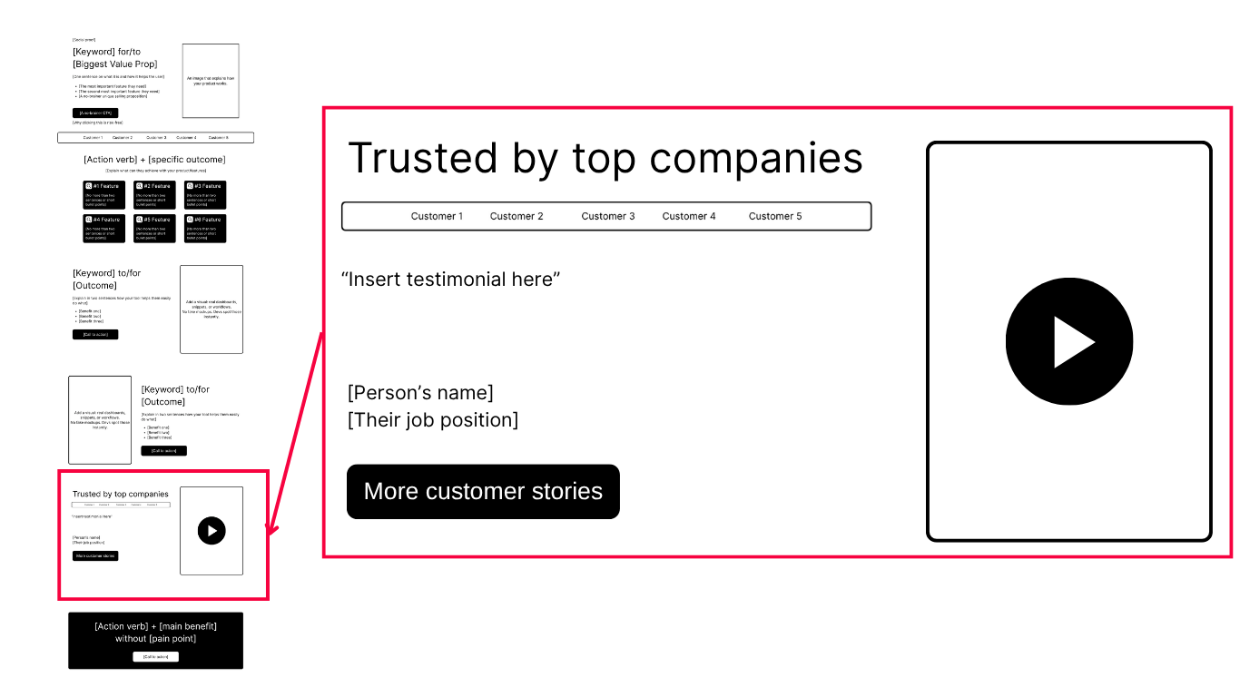
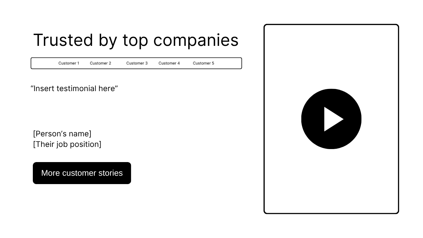
Trust (testimonial / case study) section template
Pre-footer (final call-to-action)
This is your last shot. The visitor scrolled all the way down here, which means they're interested but not convinced yet.
Don't waste it.
And (they're gonna hate me for this but…) for your business' sake, don't copy n8n's landing page.
Bad pre-footer (call-to-action) section
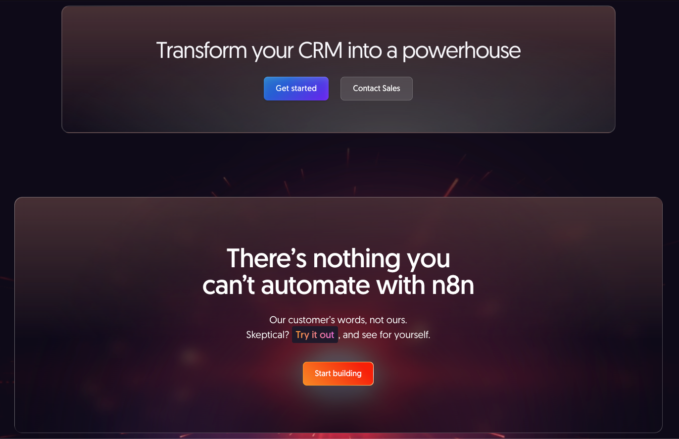
I mean, I love n8n, I really do… but come on… wtf is this?
Two pre-footer sections, next to each other, where the one says: "Transform your CRM into a powerhouse"...
This is what happens when someone relies on AI too much.
Great pre-footer (final call-to-action) example
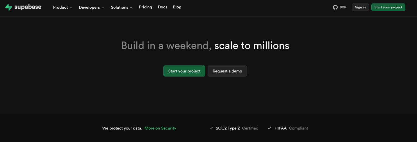
Supabase has one of the best call-to-actions I've ever seen.
Instead of telling you to "revolutionize" or "transform" the way you work, they tell you what you actually want to achieve.
The headline does 3 things immediately:
- It targets a developer's timeline, not a business goal ("weekend → millions").
- It makes a measurable promise – you'll ship something real, fast.
- It's relatable. Every dev's dream is to build something small that grows big.
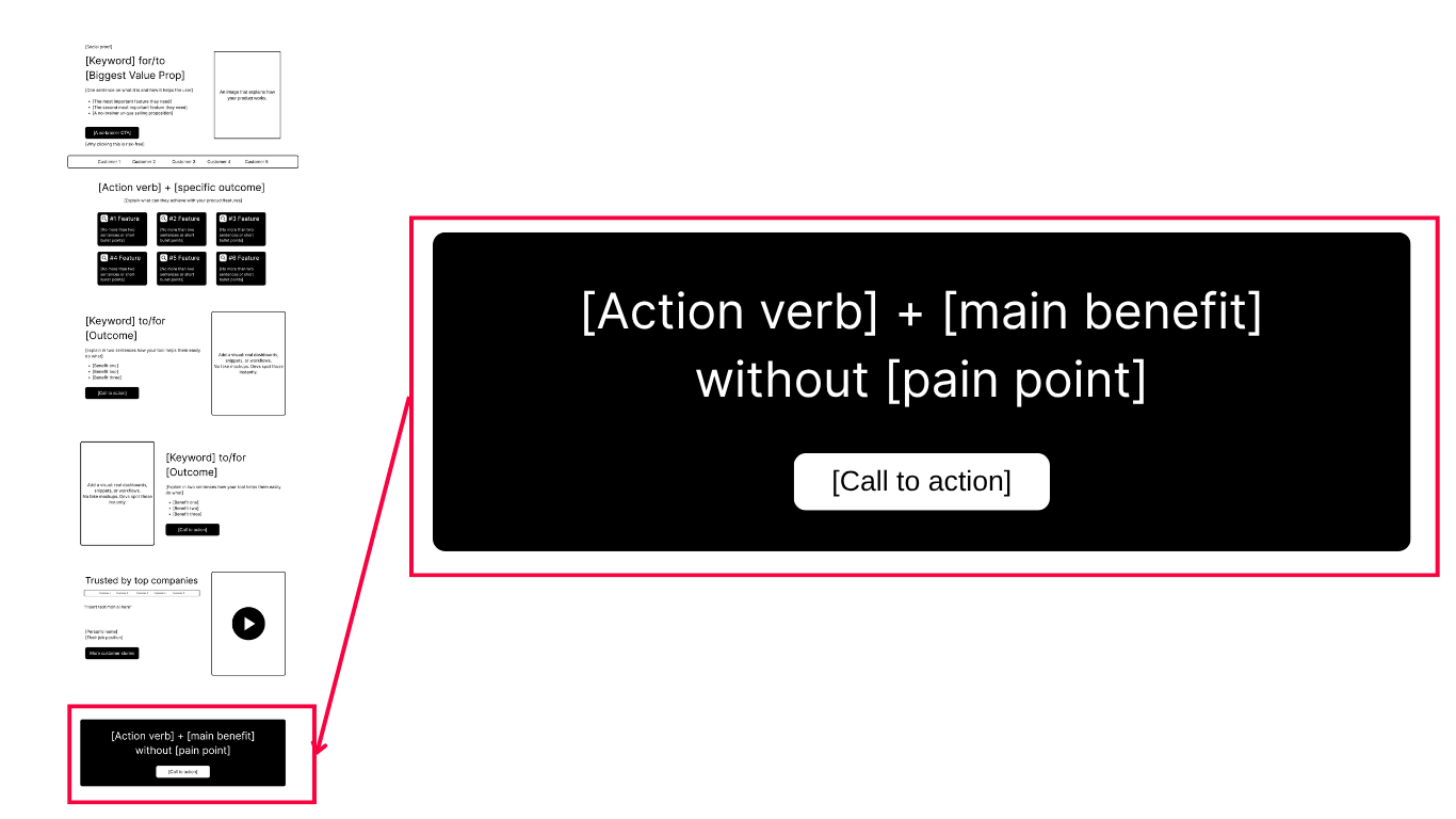
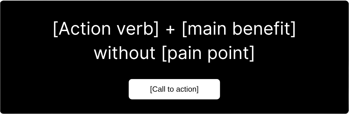
Pre-footer (final call-to-action) template
Free templates for creating developer landing pages
Gallery: 100+ great developer landing pages
To see more real examples of how devtool pages are built, check out this gallery made by Evil Martians.
You'll notice what strong pages have in common, like clear headlines, clean structure, and strong credibility.
And you'll also spot the usual mistakes right away.
Conclusion
If there's one thing my audit of 374 devtool landing pages taught me, it's this:
Every section needs to earn trust, not demand attention.
- Your hero should instantly tell me what the tool does and who it's for.
- Your features should sound like capabilities, not corporate poems.
- Your use cases should show real problems being solved, not imaginary personas.
- Your trust section should have metrics, faces, and real-world impact.
- And your pre-footer should close with confidence, not desperation.
When you combine clarity with credibility, you don't just write landing pages. You build conversion machines.
If your developer landing page doesn't convert and you need more than just a guide, drop me a message on LinkedIn or schedule a consultation call.